
Manufacture
Explore our packaging factory, production equipment and rigid box manufacturing operations.
Explore Manufacturing
 Folding Rigid Boxes
Space-saving rigid packaging designs.
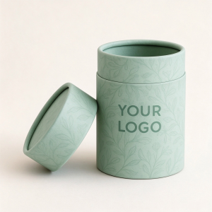 Packaging Tube Boxes
Distinctive cylindrical paper packaging.
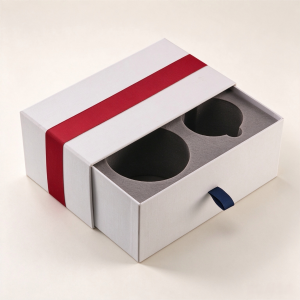 Drawer Boxes
Elegant sliding drawer box structures.
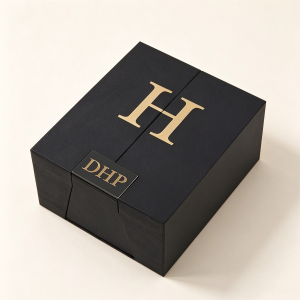 Magnetic Closure Boxes
Premium boxes with secure magnetic closure.
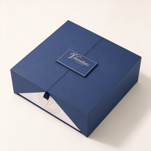 Rigid Boxes
Durable and luxurious paperboard packaging.
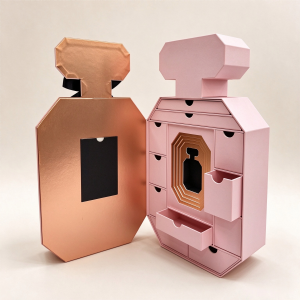 Advent Calendar Boxes
Multi-compartment seasonal gift packaging.
Explore our packaging factory, production equipment and rigid box manufacturing operations.
Explore Manufacturing
Discover our workflow from structural development and sampling to printing, assembly and quality control.
Explore Our Capabilities
Learn about responsible material choices, recyclable packaging design and reducing unnecessary material use.
Explore SustainabilityChoosing between CMYK and Pantone affects more than the appearance of your custom rigid box. It influences brand color matching, printing cost, sample approval and production consistency. This practical guide explains how to choose the right printing approach for premium packaging.
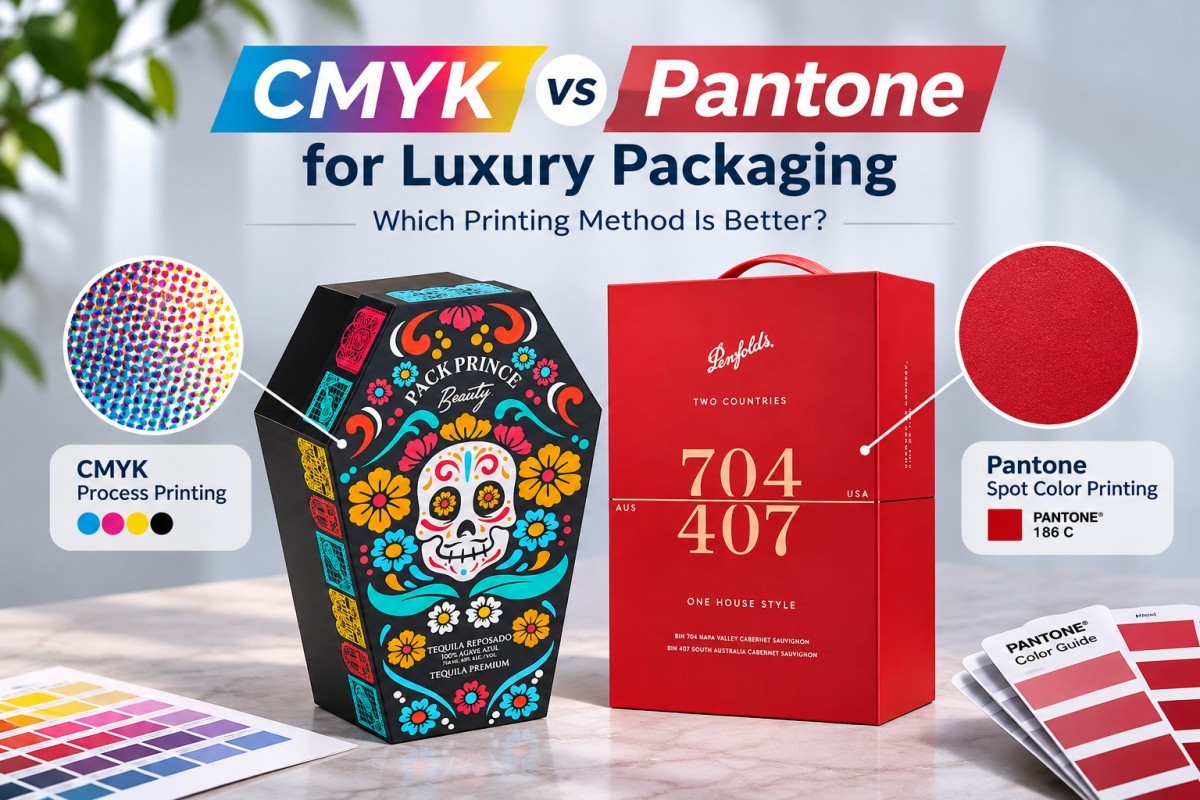
Choose CMYK for photographs, gradients and artwork containing many colors. Consider Pantone spot color printing for brand-critical logos, solid colors and specific shades that are difficult to reproduce with CMYK. Luxury packaging can also combine both methods: CMYK for detailed imagery and Pantone for important brand colors.
Neither method guarantees identical results on every substrate. Paper, ink, coating, printing conditions and approved color references all influence the final appearance.
CMYK and Pantone are two different approaches to specifying and reproducing printed colors. Understanding the distinction helps packaging buyers communicate more clearly with manufacturers.
CMYK stands for Cyan, Magenta, Yellow and Key (Black). These four inks are printed in controlled combinations to reproduce images and a broad range of colors.
Pantone Matching System (PMS) references identify standardized color targets. In conventional spot-color printing, a dedicated ink is mixed and printed to reproduce the specified color.
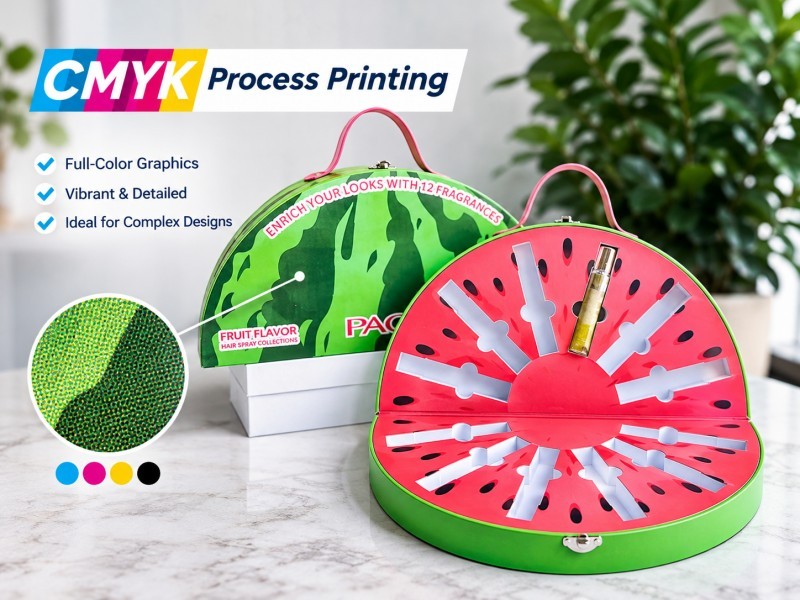
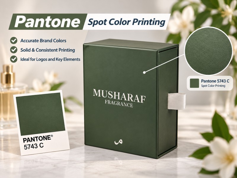
For example, a skincare box featuring a full-color botanical illustration may be well suited to CMYK. A luxury fragrance box with one distinctive corporate blue may benefit from a specified Pantone spot color.
| Factor | CMYK | Pantone Spot Color |
|---|---|---|
| Ink system | Four process inks | Dedicated ink for each selected spot color |
| Best application | Images, gradients, complex artwork | Logos, solid areas, brand-critical colors |
| Color range | Limited by process color gamut | Can reproduce selected colors outside CMYK gamut |
| Consistency | Requires process and color management | Defined spot-color target supports closer control |
| Cost consideration | Often efficient for multi-color artwork | Dedicated inks and setup may add cost |
| Substrate influence | Yes | Yes |
| Physical proofing | Recommended for color-critical jobs | Recommended for color-critical jobs |
The correct choice depends on the actual artwork and production plan. A simple one-color spot-color job is not necessarily more expensive than a four-color process job, while adding several spot colors to an existing CMYK job can increase complexity.
Your packaging includes product photography, detailed illustrations, gradients or many colors that change across the design.
Your packaging relies on a small number of critical solid brand colors, and a defined physical color target is important.
Your artwork needs full-color images alongside a carefully controlled brand logo or background color.
CMYK is often practical for ingredient illustrations, lifestyle imagery and multiple product variants. A Pantone reference may be useful when the same brand color appears across several packaging formats.
Large solid-color backgrounds can make slight color differences more noticeable. If a specific shade is central to the brand identity, a spot-color approach may be worth evaluating.
Minimalist packaging often uses one or two colors, specialty paper and a decorative logo. Depending on the artwork, a spot color or even the natural color of the wrapping paper may be preferable to full-color printing.
A common misunderstanding is that specifying a Pantone number automatically eliminates color differences. In practice, the final printed appearance depends on several interacting factors.
White coated paper, uncoated paper and colored specialty paper can produce different visual results. A transparent or partially transparent ink may be influenced by the underlying surface.
Digital samples and offset-printed production runs may use different inks, equipment and color reproduction processes. A digitally printed sample is not always a reliable final reference for a Pantone offset job.
Matte lamination, gloss lamination and varnish can change the perceived depth, contrast or appearance of printed colors. Finishing should therefore be included in the color approval process.
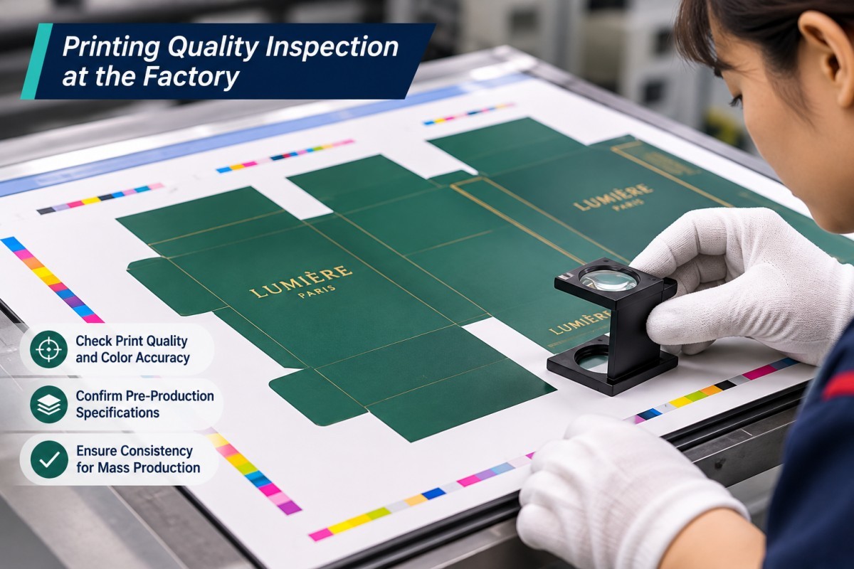
Ink density, substrate variation, press calibration and other production conditions affect color reproduction. A defined reference and suitable quality-control process help manage variation.
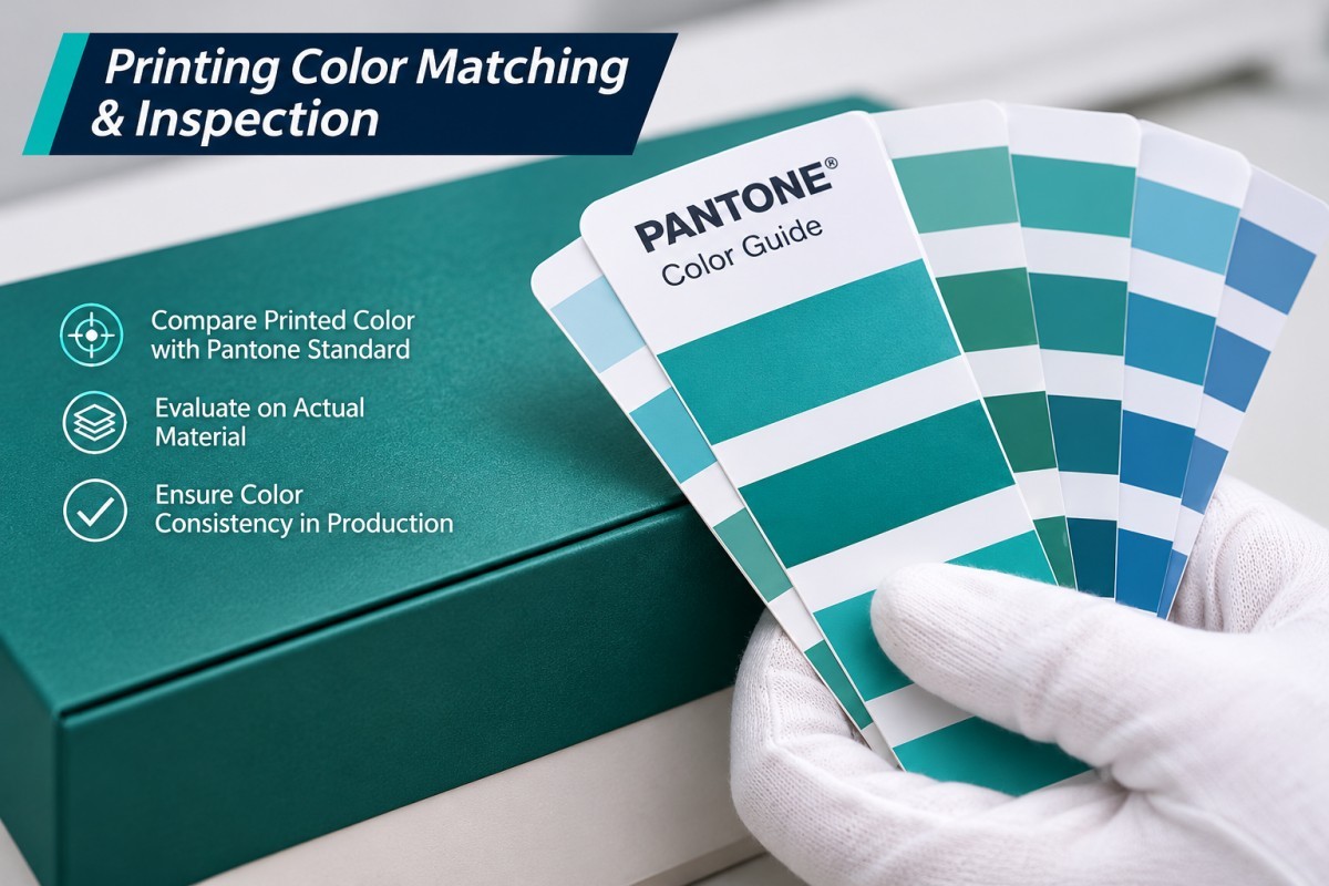
For projects where color matching is critical, the buyer and manufacturer should agree on the physical reference, printing method and acceptance criteria before production.
One DHP Boxes project involved a custom magnetic rigid box with a two-color design. During initial sampling, the digitally printed CMYK sample showed visible color differences and banding.
The client compared the sample with other suppliers. Although the client recognized the quality of the box structure, strong magnetic closure and initial embossed logo, the printed color did not meet expectations.
The project moved to Pantone spot-color offset printing, and the logo finish was changed from embossing to hot foil stamping.
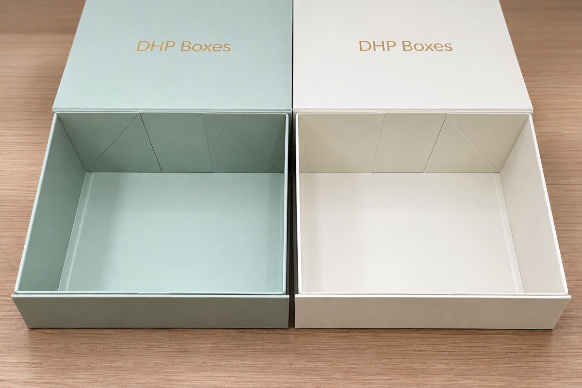
A new pre-production confirmation sample was prepared. The client approved the color appearance and confirmed that the visible banding issue had been resolved before the production run proceeded.
The client subsequently provided a five-star evaluation. The sample photographs associated with this project show the pre-production confirmation sample, not an independently verified mass-production inspection result.
What this case demonstrates: Changing the printing process can address a specific color reproduction problem, but the solution must be confirmed through a sample using the intended production approach. Pantone is not a universal cure for every printing defect.
For brand-critical colors, a structured approval process is more reliable than relying only on a screen preview or an informal color description.
For repeat orders, a retained approved sample can help communicate expectations, but material and process changes still require review.
Not always. The relative cost depends on how many colors are required, the printing process, order quantity, artwork and press setup.
For photographic packaging, CMYK is generally a practical starting point. For a simple design using one or two solid colors, dedicated spot-color printing may be commercially reasonable. Adding a Pantone color to a full CMYK job may require additional setup or printing capacity.
Packaging buyers should request quotations based on the same structural specifications, paper, finishing and quantity when comparing different printing options.
The cheapest printing option is not always the best value if color problems lead to rejected samples, artwork changes or delayed approvals.
Before requesting a quotation from a custom rigid box manufacturer, prepare the following information:
At DHP Boxes, printing is considered alongside box structure, wrapping materials, decorative finishing and sample approval. These decisions affect both the visual presentation and the practicality of producing custom luxury packaging.
For a new packaging project, buyers can discuss whether CMYK, Pantone spot colors or a combined approach is suitable for the artwork and intended substrate.
Explore our custom packaging capabilities, learn about our manufacturing operations, or review our certifications and compliance information.
The recommended printing specification should be confirmed during artwork review and sampling rather than selected solely from an online comparison.
Not in every situation. Pantone spot colors are useful for defined brand colors and solid areas, while CMYK is generally better suited to photographs, gradients and complex full-color artwork.
Some Pantone colors can be closely simulated using CMYK, but others fall outside the available process-color gamut. Results depend on the printing condition and substrate.
Yes. Packaging artwork can combine CMYK for images with dedicated spot colors for logos or other brand-critical elements, subject to the selected production process.
No. Pantone provides a defined color reference, but paper, ink, coatings, equipment and production conditions still affect the final appearance.
Digital and offset printing may use different color reproduction technologies, inks and calibration methods. For critical colors, approve a sample representative of the intended production process.
Consider Pantone when the logo uses a specific solid brand color requiring close control. If the logo is photographic, multicolored or produced using foil stamping, a different approach may be more suitable.
Yes. Paper color, texture, coating and absorbency can influence printed appearance. Both process and spot colors should be evaluated on the intended material.
Provide the artwork, color references, selected paper, finishing specifications and any approved physical samples. Clearly identify which colors are critical to your brand.
We understand that choosing the right boxes for your industry is critical. That’s why we invite you to contact us. Whatever your goals, DHP will help you achieve them.
Contact NowWe have a strong team that works closely with customers to meet market challenges and effectively meet specific needs. Your thought, we fulfill.
Request a Custom QuoteDHP Factory is committed to delivering manufacturing excellence.
