
How We Control Color Consistency in Custom Rigid Box Manufacturing
How We Control Color Consistency from Sample to Mass Production
Color consistency is essential for luxury packaging, especially when brands reorder custom rigid boxes across different production batches. Discover how DHP Boxes approaches artwork review, Pantone and CMYK references, sample approval, printing checks and finished-box inspection to manage color variation during manufacturing.
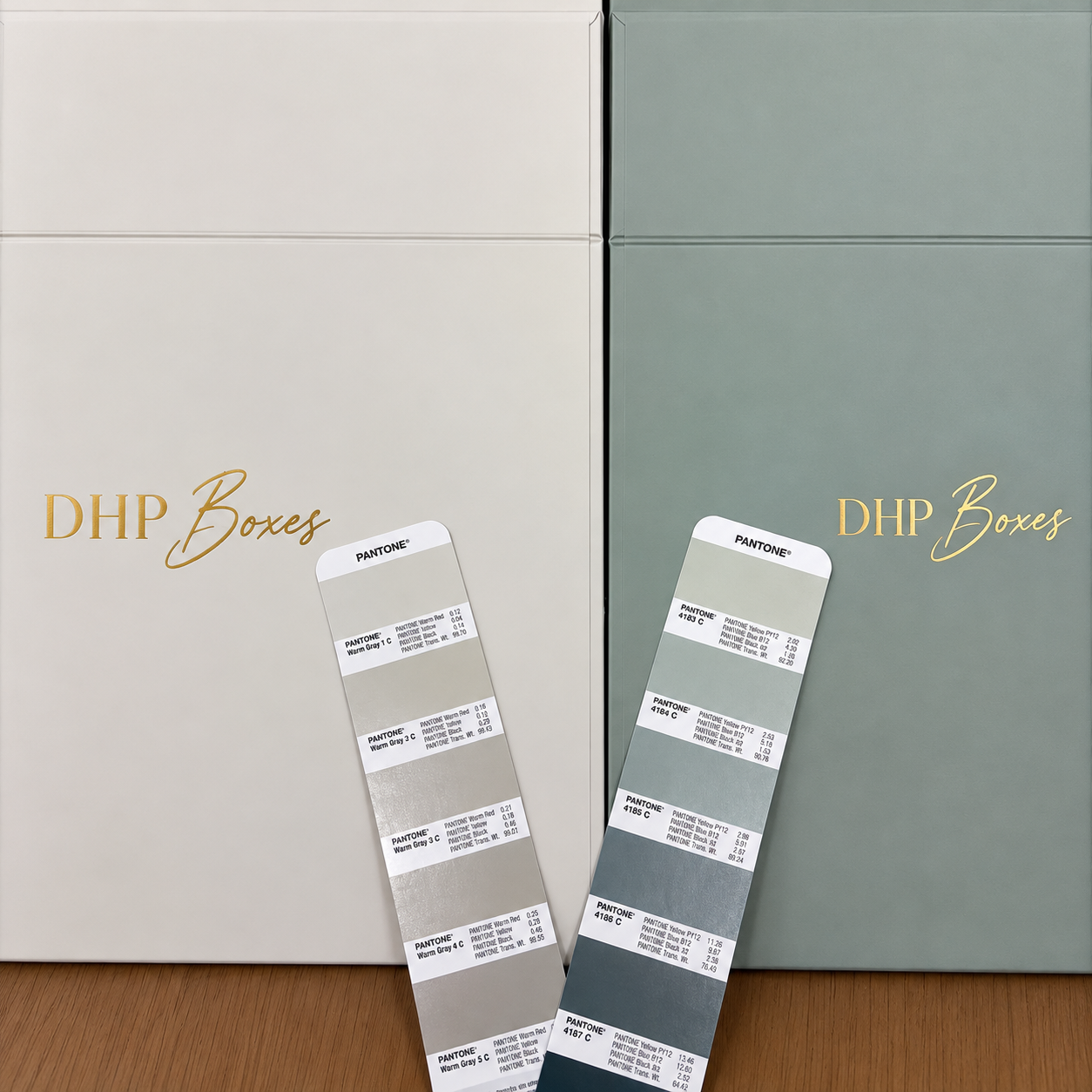
Quick Answer: How Do Manufacturers Maintain Packaging Color Consistency?
Packaging color consistency is maintained by defining an approved color reference, controlling the printing substrate and method, comparing production output with the approved sample, and inspecting finished packaging. For brand-critical colors, manufacturers may use Pantone references, physical press proofs, controlled viewing conditions and agreed color tolerances. The objective is controlled, repeatable color reproduction—not a promise that every material or printing method will look perfectly identical.
Why Color Consistency Matters in Custom Luxury Packaging
For a premium brand, packaging color is part of brand recognition. Customers may see the same product in retail stores, promotional campaigns, gift sets and online product photographs. Noticeable differences between packaging batches can weaken the consistency of the overall brand presentation.
This becomes particularly important for cosmetic packaging, perfume gift boxes, jewelry packaging, watch boxes and luxury spirits packaging. These products often rely on carefully selected brand colors and refined surface finishes.
Unlike a simple printed leaflet, a custom rigid box combines several materials and production processes. The printed exterior may be laminated, wrapped around greyboard, joined to a separate lid or combined with a colored insert.
Each stage can influence the final appearance. Consequently, color consistency should be evaluated on the finished packaging—not only on the original digital artwork.
At DHP Boxes, printing is part of a broader workflow involving structural design, sampling, surface finishing, assembly and quality control. This integrated approach helps connect visual approval with the actual packaging construction.
Our Packaging Color Control Workflow: From Artwork to Shipment
The following workflow explains the main color-control checkpoints relevant to custom rigid box manufacturing. The exact approval documents, measurement methods and inspection frequency are established according to the project's specifications.
Effective color control requires the buyer and manufacturer to agree on what is being matched. A Pantone reference, a digital PDF, a printed sample and a finished laminated box do not represent identical approval conditions.
Step 1: Confirm Artwork, Color References and Printing Specifications
Color management begins before ink reaches the printing press. The first task is to understand which colors are essential to the brand and how they are defined in the artwork.
CMYK Artwork
CMYK uses cyan, magenta, yellow and black inks to reproduce a wide range of printed colors. It is commonly used for product photographs, gradients and multicolor packaging graphics.
However, identical CMYK values do not guarantee identical visual results across different printing conditions. Paper, ink behavior, color profiles and finishing can all affect reproduction.
Pantone Spot Colors
Pantone references are useful when a brand requires a specific corporate color. The Pantone code should be identified clearly, including the relevant reference type and intended substrate.
A Pantone number is a color target, not a guarantee that every substrate will produce an identical result. The final printed appearance should still be evaluated on the selected material.
Important Prepress Questions
- Is the artwork prepared in CMYK, Pantone spot colors or a combination?
- Which colors are critical to brand recognition?
- Is there a physical color reference or previously approved packaging sample?
- Will the artwork be printed on coated, uncoated or textured paper?
- Will lamination or another finishing process change the final appearance?
DHP's published manufacturing workflow includes prepress artwork review, CMYK/Pantone color management and printing preparation.
Step 2: Confirm Paper and Material Before Matching Color
One of the most common causes of packaging color differences is changing the paper substrate without reconsidering the color target.
For custom rigid boxes, exterior wrapping materials may include coated art paper, textured specialty paper, colored paper or other decorative substrates.
Paper Whiteness and Base Color
A bright white paper can produce a different printed appearance from cream-colored or natural kraft paper. The underlying substrate influences the light reflected through or around the ink layer.
Coated vs Uncoated Paper
Coated paper generally has different ink absorption and surface reflection characteristics from uncoated paper. This can affect saturation, sharpness and perceived color depth.
Paper GSM and Surface Texture
Paper grammage, expressed in grams per square meter (GSM), does not directly determine whether a printed color becomes darker or lighter.
For example, two papers with different GSM values may reproduce the same ink differently because their coatings, whiteness, porosity or surface textures differ. A heavier sheet is not automatically darker after printing.
Specialty Paper
Textured, pearlized, metallic or dyed specialty papers may create additional color-matching challenges. Some surfaces are better suited to foil stamping or other decorative treatments than conventional full-color printing.
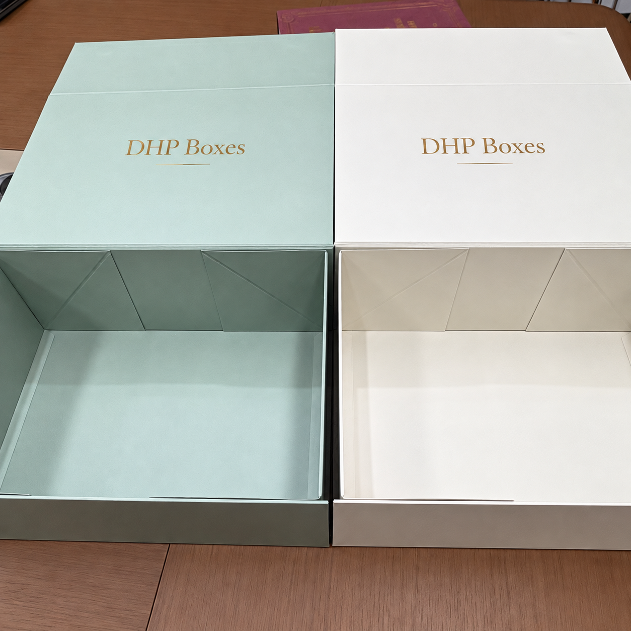
Step 3: Approve the Right Sample Before Mass Production
Sample approval is one of the most important stages in packaging color consistency. The buyer and manufacturer must establish whether the sample is being approved for structure, artwork placement, materials or production color.
White Sample
A white sample is mainly used to evaluate dimensions, box construction, opening movement and product fit. It is not a color standard for the final printed packaging.
Digital Printed Sample
Digital samples are useful for reviewing artwork layout, visual balance and general presentation. However, a digitally printed prototype may not match the final offset-printed packaging exactly.
Offset Ink Sample or Press Proof
When brand colors are especially important, an offset-printed sample or suitable production-representative proof can provide a more relevant reference for offset mass production.
The selected paper, ink specification and finishing requirements should be considered together. A proof printed on different material may not accurately predict the finished box.
Signed or Documented Approval
For important projects, the approved physical sample should be identified clearly and supported by written confirmation of the material, printing method, color reference and finishing requirements.
This helps prevent confusion between an early visual prototype and the final approved production standard.
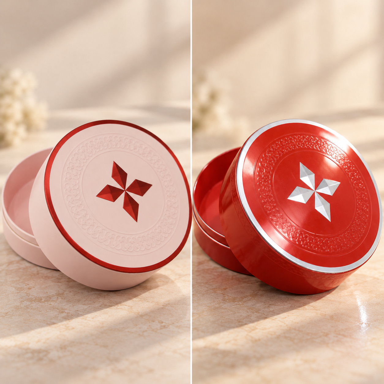
Step 4: Monitor Color During Mass Production Printing
After approval, the printing process must reproduce the agreed design and color appearance as consistently as practical across the production run.
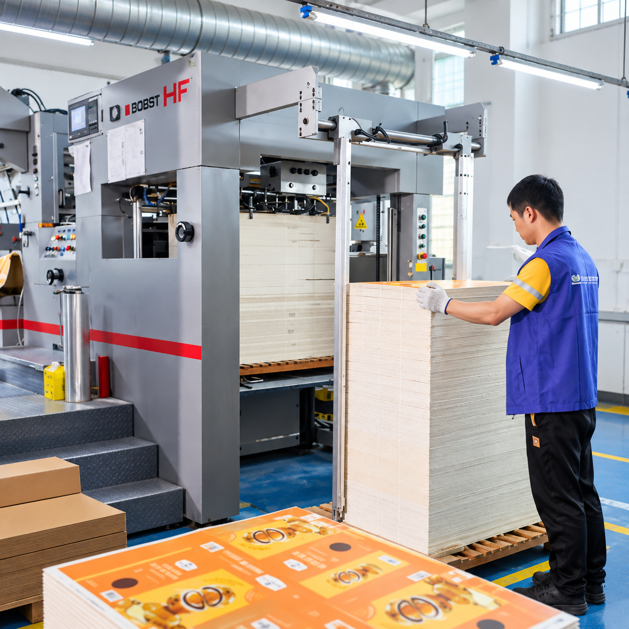
DHP Boxes lists Heidelberg offset printing equipment among its factory capabilities and describes color management, printing checks and production monitoring within its manufacturing workflow.
Printing Setup
Printing setup should take account of the approved substrate, ink specification, artwork, printing conditions and color reference. Where applicable, press operators adjust printing conditions to bring the output into the agreed acceptance range.
Production Color Checks
During a production run, printed sheets should be compared against the approved standard using the agreed inspection method.
Depending on the project, checks may involve visual comparison, printed control patches, densitometric readings or colorimetric measurement. The available instruments and inspection frequency should be confirmed with the manufacturer rather than assumed.
Registration and Ink Appearance
Color quality involves more than matching hue. Registration errors, uneven ink coverage, streaks, mottling and other printing defects can affect the perceived quality of the packaging.
For detailed artwork, printing registration should also be evaluated because misalignment between process colors can reduce edge sharpness.
Step 5: Check Color After Lamination, Finishing and Rigid Box Wrapping
Even when a printed sheet meets the approved standard, the final rigid box may appear different after finishing and assembly.
Matte and Gloss Lamination
Matte and gloss films change surface reflection. Gloss finishes can make colors appear more vivid under certain lighting, while matte surfaces may create a softer visual impression.
Soft-touch lamination introduces an additional tactile effect and may also influence the appearance of the printed colors.
Foil Stamping and Spot UV
Metallic foil reflects light differently from printed ink. Spot UV creates localized gloss contrast. Both effects can change the way surrounding colors are perceived, even when the underlying printed color remains unchanged.
Wrapping and Assembly
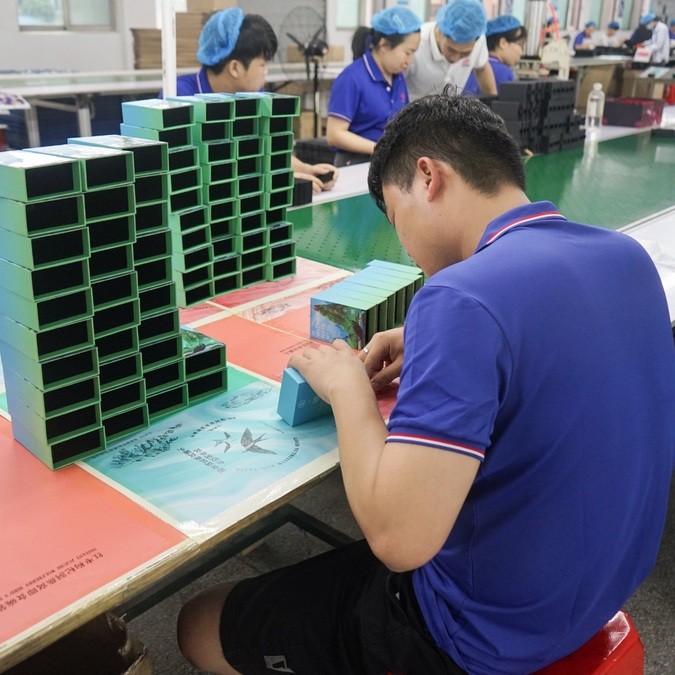
During rigid box production, the printed sheet is bonded to greyboard and wrapped around corners and edges. Artwork placement, wrapping alignment and material tension influence the final presentation.
Separate components such as lids, bases and sleeves should be compared where color continuity is important. Differences in material batches, print orientation or finishing can become more visible when the components are assembled side by side.
Step 6: Final Color Inspection and Repeat-Order Control
Final inspection should consider the appearance of the assembled box, not only the flat printed sheet.
For custom rigid packaging, this may include checking the exterior color, consistency between lids and bases, printing defects, decorative finish alignment and overall presentation against the approved sample.
Comparing Finished Boxes
When several components share the same brand color, they should be viewed together under suitable lighting conditions. This helps identify differences that might be less noticeable when each component is inspected separately.
Repeat Production Orders
For repeat orders, retaining the approved color specification and relevant production references can help maintain continuity. Buyers should also identify whether paper, printing methods, finishing materials or artwork have changed since the previous order.
Handling a Color Deviation
If a visible or measured color difference exceeds the agreed acceptance criteria, the affected output should be evaluated before release. Depending on the cause, corrective actions may involve checking the substrate, ink, press settings, finishing or approval reference.
The decision to accept, rework or reproduce affected packaging should follow the agreed specification and quality procedures.
Pantone vs CMYK: Which Provides Better Packaging Color Consistency?
Both Pantone spot colors and CMYK can support professional packaging production. The better choice depends on the artwork, substrate, budget and required brand-color accuracy.
| Factor | Pantone Spot Color | CMYK Process Printing |
|---|---|---|
| Primary Use | Defined brand colors and selected solid graphics | Photographs, gradients and multicolor artwork |
| Color Reference | Specified spot-color standard | Defined CMYK values and printing conditions |
| Consistency | Can support controlled matching of brand colors | Can provide consistent results under controlled conditions |
| Material Influence | Still affected by substrate and finishing | Also affected by substrate and finishing |
| Artwork Flexibility | Best suited to selected colors or combinations | Suitable for complex full-color designs |
| Cost Consideration | Additional spot inks may add setup or production cost | Often efficient for full-color artwork |
Some luxury packaging projects combine CMYK graphics with one or more Pantone spot colors. This can help balance detailed artwork with important brand-color requirements.
For more information about printing techniques, read our guide to five printing methods used for premium packaging boxes.
Our Pantone packaging color matching guide explains the role of standardized color references in brand consistency.
How Are Packaging Color Differences Measured?
Visual inspection is important, but some packaging projects also require instrument-based color evaluation.
Color Measurement Instruments
Spectrophotometers can measure reflected light and generate colorimetric values. Densitometers are commonly used to monitor aspects of printing density and process control.
These tools serve different purposes. Ink density readings do not, by themselves, prove that a finished print matches a target color.
Understanding Delta E (ΔE)
Delta E is a numerical measure of color difference calculated using a defined color-difference formula. A lower value generally indicates a smaller measured difference under the specified conditions.
However, Delta E values are not interchangeable across all formulas. For example, CIE76 and CIEDE2000 can produce different numerical results for the same color pair.
There is no universal Delta E tolerance that is suitable for every luxury packaging project. The acceptable range depends on the brand requirements, color, substrate, finish, measurement conditions and agreed evaluation method.
Lighting Conditions
Colors can look different under daylight, fluorescent lighting and warm indoor illumination. This phenomenon is especially important when comparing printed materials with different inks or substrates.
For critical projects, the buyer and manufacturer should agree on the viewing conditions used for approval and inspection.
Common Packaging Color Problems and Their Causes
| Problem | Possible Cause | Recommended Action |
|---|---|---|
| Printed color differs from digital artwork | Screen display and print reproduction use different color systems | Approve a physical print reference |
| Same Pantone color looks different on two papers | Different paper whiteness, coating or ink absorption | Evaluate both actual substrates |
| Printed sample differs from mass production | Different printing method, paper or production conditions | Confirm production-representative approval |
| Color appears darker after finishing | Changes in surface reflection or film characteristics | Review the finished, laminated sample |
| Lid and base appear different | Different material or printing/finishing conditions | Inspect assembled components together |
| Repeat order differs from earlier batch | Changed substrate, materials, settings or reference | Review retained standards and current production conditions |
| Color looks different under store lighting | Lighting conditions or metamerism | Agree on controlled viewing conditions |
Packaging Color Approval Checklist for Brand Owners and Buyers
Before approving custom packaging for mass production, buyers should confirm the following information with their manufacturer.
Identify Pantone codes, CMYK specifications or an approved physical reference.
Confirm paper type, coating, texture, color and relevant material specifications.
Clarify whether production uses offset, digital, spot-color or another printing process.
Confirm matte, gloss, soft-touch, foil, Spot UV and other effects before color approval.
Document which physical sample is approved for color and final appearance.
Agree on visual or numerical tolerances and the method used to assess deviations.
Clarify the planned color-check method, responsibility and review procedure.
Retain relevant specifications and confirm changes before placing another order.
A clear approval process makes it easier to compare samples, manage expectations and resolve potential quality disagreements.
DHP Boxes: Printing and Color Management for Custom Rigid Packaging
DHP Boxes is a China-based custom rigid box manufacturer providing packaging development, physical sampling, printing, finishing, assembly and quality control for premium packaging projects.
Our published manufacturing capabilities include Heidelberg offset printing equipment, digital printing, CMYK and Pantone color management, sample development and production inspection.
Color management is especially important for rigid packaging because the final appearance depends on more than printing alone. Exterior wrapping paper, lamination, decorative finishes, box geometry and assembly all influence how customers perceive the finished product.
For perfume boxes, cosmetic gift sets, jewelry packaging, watch boxes and luxury spirits packaging, we encourage buyers to confirm important brand colors, materials and finishing requirements during sample development.
Our team can review the relationship between artwork, paper selection, printing methods and packaging construction to help establish an appropriate production specification.
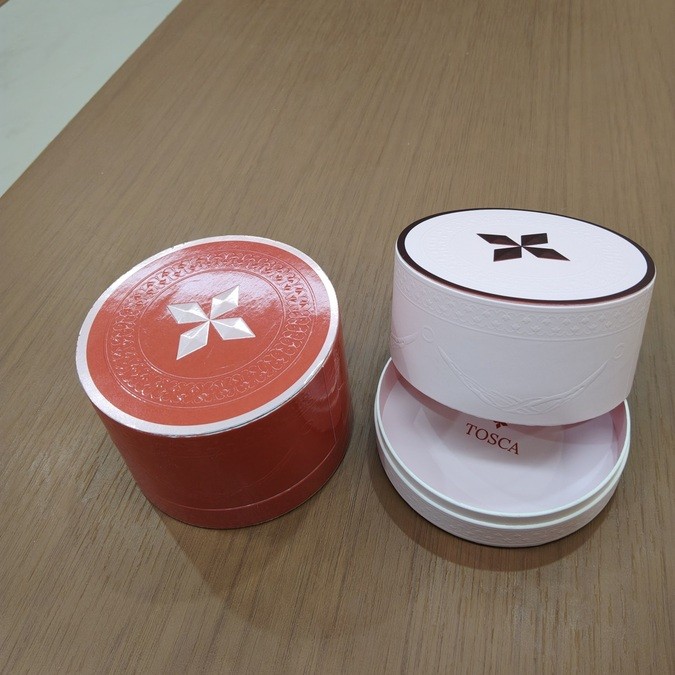
Learn more about our custom rigid box manufacturing process and printing and finishing capabilities.
Frequently Asked Questions About Packaging Color Consistency
How can manufacturers maintain packaging color consistency between samples and mass production?
Manufacturers can improve consistency by defining an approved color standard, confirming the production substrate and printing method, monitoring printing conditions and inspecting finished packaging against the agreed reference.
Why does my packaging color look different from the approved digital sample?
Digital samples and mass production may use different printing methods, inks, substrates or color profiles. A digital preview may not be suitable as the final color approval standard for offset production.
Does Pantone printing guarantee an exact color match?
No. Pantone provides a standardized reference, but actual printed results are affected by the substrate, ink, production conditions and surface finishing. Physical sample approval is still important.
Can different paper GSM values change printing color?
They can be associated with different printed appearances, but GSM alone does not determine color depth. Paper whiteness, coating, porosity and surface texture are often more directly relevant.
Does matte lamination affect packaging colors?
Yes. Matte lamination changes surface reflection and may alter perceived saturation or depth. Important colors should be approved with the intended final surface treatment.
What is an acceptable Delta E for luxury packaging?
There is no universal value suitable for every project. The acceptable tolerance should be agreed using a defined color-difference formula, measurement conditions, substrate and brand requirements.
Should I approve a printed sheet or the finished rigid box?
For color-critical packaging, both may be useful. The printed sheet helps assess printing quality, while the finished rigid box reveals the effects of lamination, wrapping, component alignment and final presentation.
How can I maintain consistent colors on repeat packaging orders?
Retain the approved reference and record the paper, printing method, ink specification, finishing and relevant acceptance criteria. Confirm any material or production changes before the repeat order.
Conclusion: Consistent Packaging Color Starts Before Printing
Reliable packaging color consistency depends on the entire manufacturing process, from artwork preparation and substrate selection to physical sample approval, printing checks, finishing and final inspection.
For luxury brands, the most effective approach is to establish a clear production reference and agree on practical acceptance criteria before mass production begins.
As a custom rigid box manufacturer in China, DHP Boxes supports brands in developing premium packaging with coordinated printing, material selection, structural manufacturing and quality inspection.
Need Consistent Brand Colors for Your Custom Packaging?
Share your artwork, Pantone references, packaging materials, sample requirements and order quantity with DHP Boxes. Our team can review the printing and finishing requirements for your next custom rigid box project.
Contact DHP Boxes