
CMYK and Pantone Printing: What’s the Difference and Which Should You Choose?
Choosing between CMYK and Pantone (PMS) impacts color accuracy, cost, and brand consistency. This guide explains how each system works, when to use them, and how DHP Boxes delivers precise results for luxury packaging.
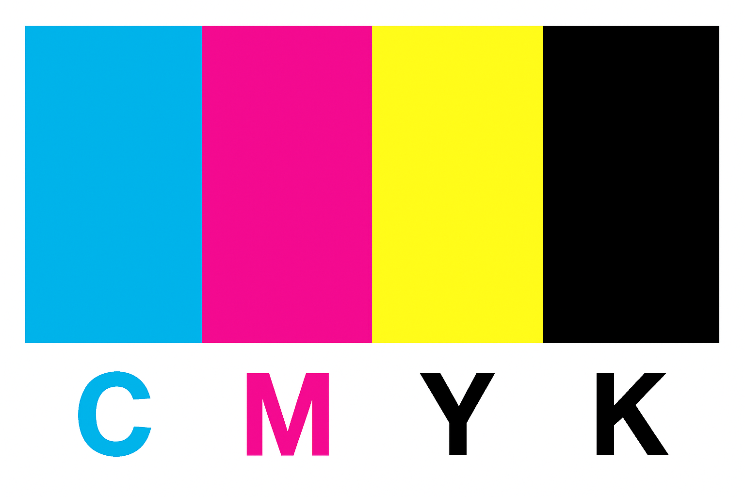
What Is CMYK Printing?
CMYK is a four-color process (Cyan, Magenta, Yellow, Black) that builds color with microscopic dots. It’s ideal for photos, gradients, and complex artwork on brochures, catalogs, and premium packaging.
How it works: subtractive color mixing using layered dots to reproduce millions of tones.
Best for: image-heavy designs, cost-effective longer runs, fast turnarounds.
Consider: color may vary slightly between presses, papers, and runs without tight color management.
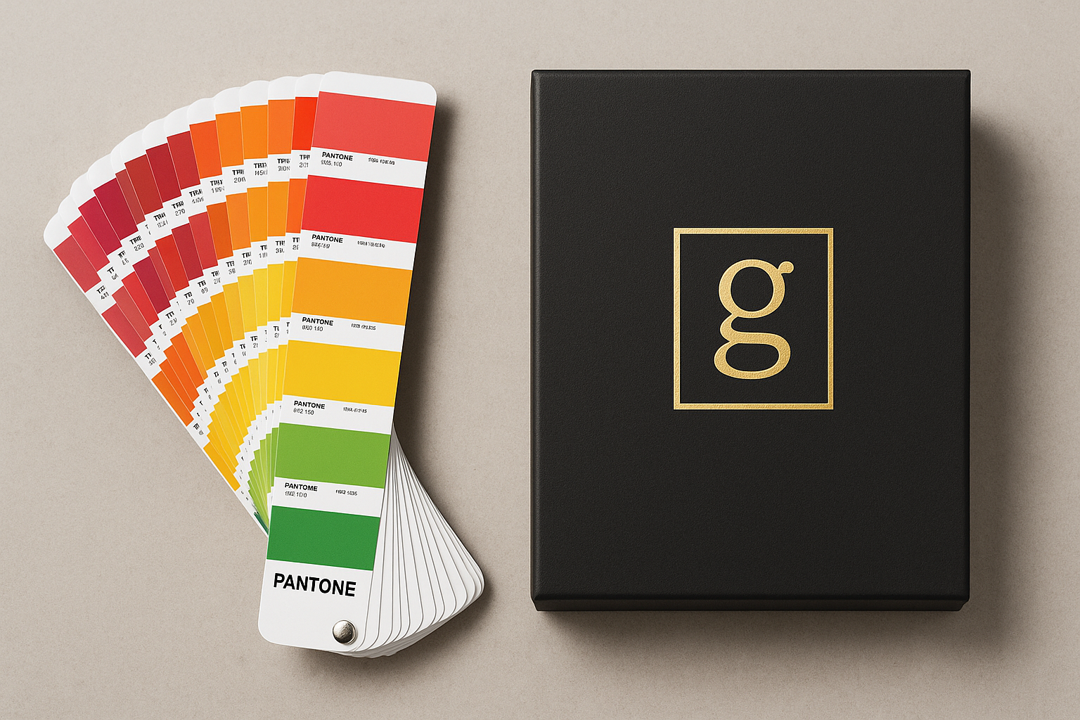
What Is Pantone (PMS) Printing?
Pantone is a spot-color system using pre-mixed, standardized inks (PMS codes). It delivers exact, repeatable brand colors across substrates and offers special inks like metallics and fluorescents.
How it works: a single, precisely mixed ink prints a uniform, solid color.
Best for: logos, brand colors, minimal-color designs, luxury finishes, metallic accents.
Consider: higher unit cost for short runs; additional plates for each spot color.
CMYK vs Pantone: A Quick Comparison
| Feature | CMYK Printing | Pantone Printing |
| Color creation | Dots of C, M, Y, K blend on paper | Pre-mixed spot inks (PMS codes) |
| Consistency | Good, but can vary across runs | Excellent, highly repeatable |
| Best use cases | Photos, gradients, complex art | Logos, brand colors, metallics |
Cost | Efficient on longer runs | Higher per color/plate |
Which Should You Choose?
Pick CMYK for image-rich designs, gradients, catalogs, and cost-optimized larger runs.
Pick Pantone for strict brand colors, logo accuracy, special inks (metallic/fluorescent), and luxury effects.
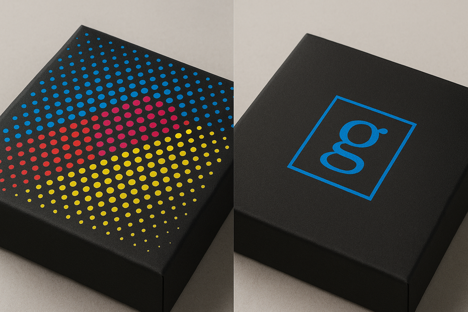
How DHP Boxes Ensures Accurate Color?
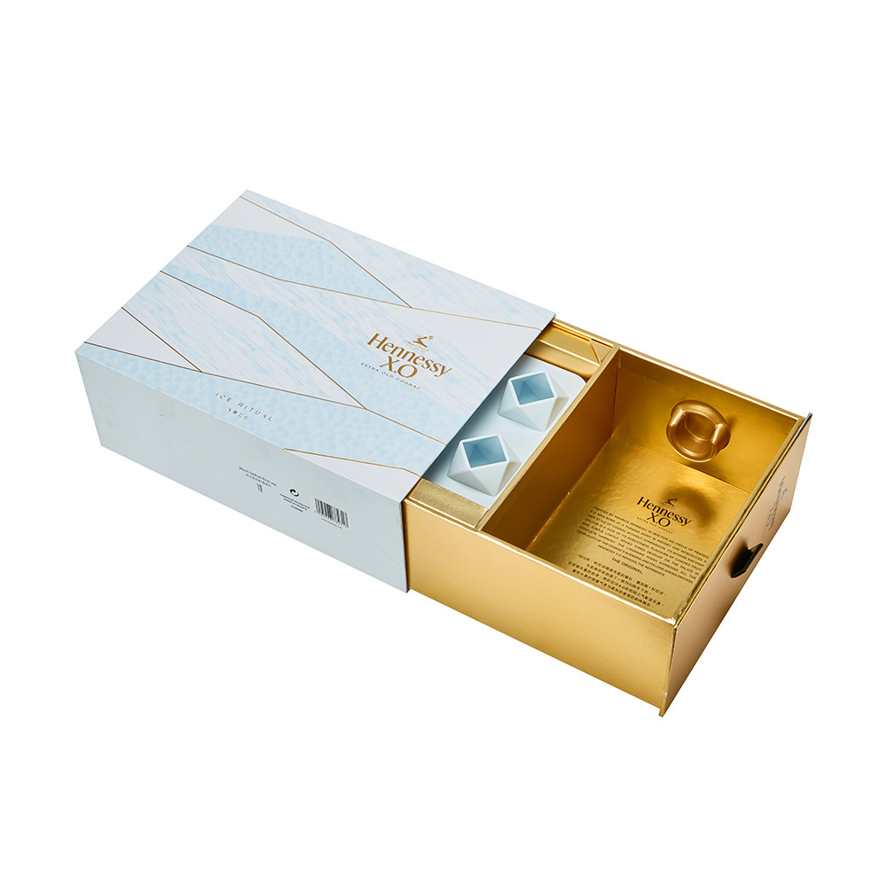
As a custom packaging manufacturer, DHP Boxes provides both CMYK and Pantone printing on premium rigid boxes, cosmetic boxes, wine boxes, and specialty packaging.
Prepress checks: RGB→CMYK conversion, spot-color mapping, bleed/safe area review.
Proofing options: on-screen soft proof and physical print proof on chosen stock.
Finishes: foil stamping, emboss/deboss, matte/soft-touch lamination, UV, and metallic Pantone inks.
Materials: recyclable paperboards and eco-friendly options on request.
Pro Tips for Brand-Safe Color
Start with brand standards: define PMS colors and CMYK equivalents.
Choose the right stock: coated vs uncoated affects appearance.
Use Rich Black wisely: reserve rich black for large solids.
Minimize conversions: avoid repeated RGB↔CMYK conversions.
Request drawdowns: approve metallic or fluorescent Pantones on final stock.
FAQ: CMYK & Pantone
Can Pantone colors be converted to CMYK exactly?
Not always. Many PMS colors fall outside the CMYK gamut. A closest-match CMYK build is provided with proofing.
When should I use both CMYK and Pantone in one job?
Use CMYK for images and Pantone for logos or brand-critical colors.
Will my colors match across different papers?
Paper affects ink appearance. Approve a physical proof on final stock for accuracy.
